
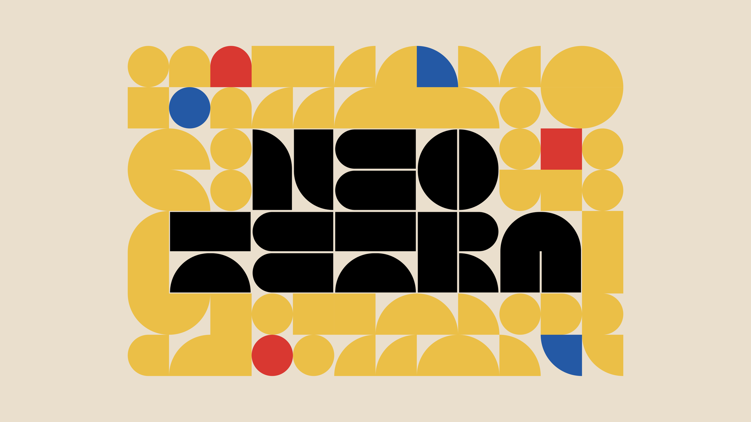
NEO TETRA TYPEFACE
All caps display font. Download link on Behance. It’s free!
PROJECT OVERVIEW
Inspired by the extraordinary geometric abstractions of Bauhaus, Neo Tetra is a typographic study that reimagines 26 letters, 10 numbers, and 12 symbols as geometric forms comprised of primitive shapes.
TOOLS
Figma - vector mapping
Glyphs 3 - metrics fine tuning
BACKGROUND
The Bauhaus is one of the most influential movements in the history of design. With a focus on structure and precision, its philosophy hypothesizes that clean lines and simple shapes of geometric forms can create a sense of order, clarity, and efficiency.

Joost Schmidt, Poster for Weimar Exhibition, 1923
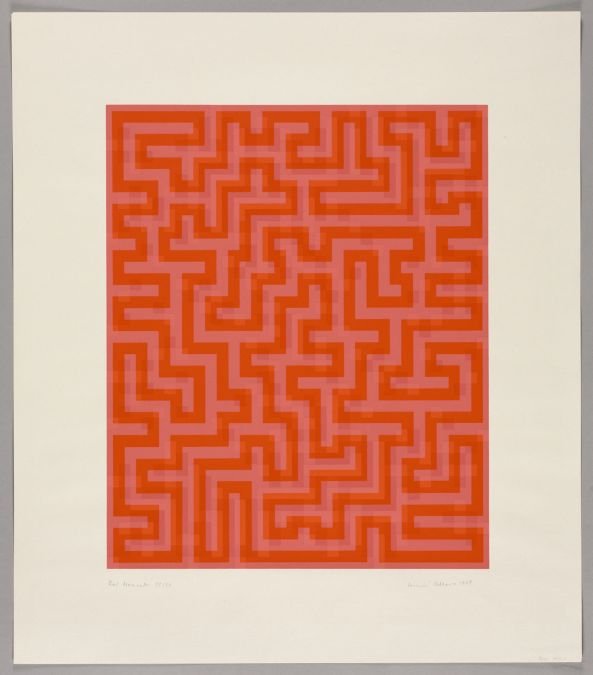
Anni Albers, Red Meander, 1969

Herbert Bayer, Research in Development of Universal Type, 1927
Contemporary adaptations of the movement’s design principals further embrace the minimalistic geometry explored by the school, creating bold designs that incorporate basic shapes and limited color palettes. They embody a continuation of such utilitarian view on design, stripping away the inessentials.
Adobe Stock - Ngupakarti, Bauhaus Patterns
99 Designs - Artopelago™, Logo Design
INITIAL SKETCHES
To stay true to Bauhaus philosophy, I want to make the typeface monospaced, with each alphabet encompassed in a perfect square to create the sense of unity and balance.
DIGITAL CONSTRUCTION
I made two cleaner versions of the construction guidelines to generate two sets of alphabets. I wanted to keep these logo grids as simple as possible.

The result came out as follows. The lighter ones are questionable, but I was generally happy with the legibility of most forms.


I decided to then merge the two grids and create a version that makes use of effective elements from both versions.

This ended up being the final construction guide. Every alphabet, number, and symbol will follow the lines from this grid.
The construction of the glyphs can be summarized in another way: Each character is divided into four parts, and each part contains and only contains one of the four following primitive shapes and their rotations:

In fact, the circle is used in none of the 26 alphabets and 10 numbers, only in the symbols.
These shapes will either link or not, creating thin lines throughout each glyph. These subtle separations are what help distinguish forms that have the same silohettes in the design: H and I, O and 0, U and V.

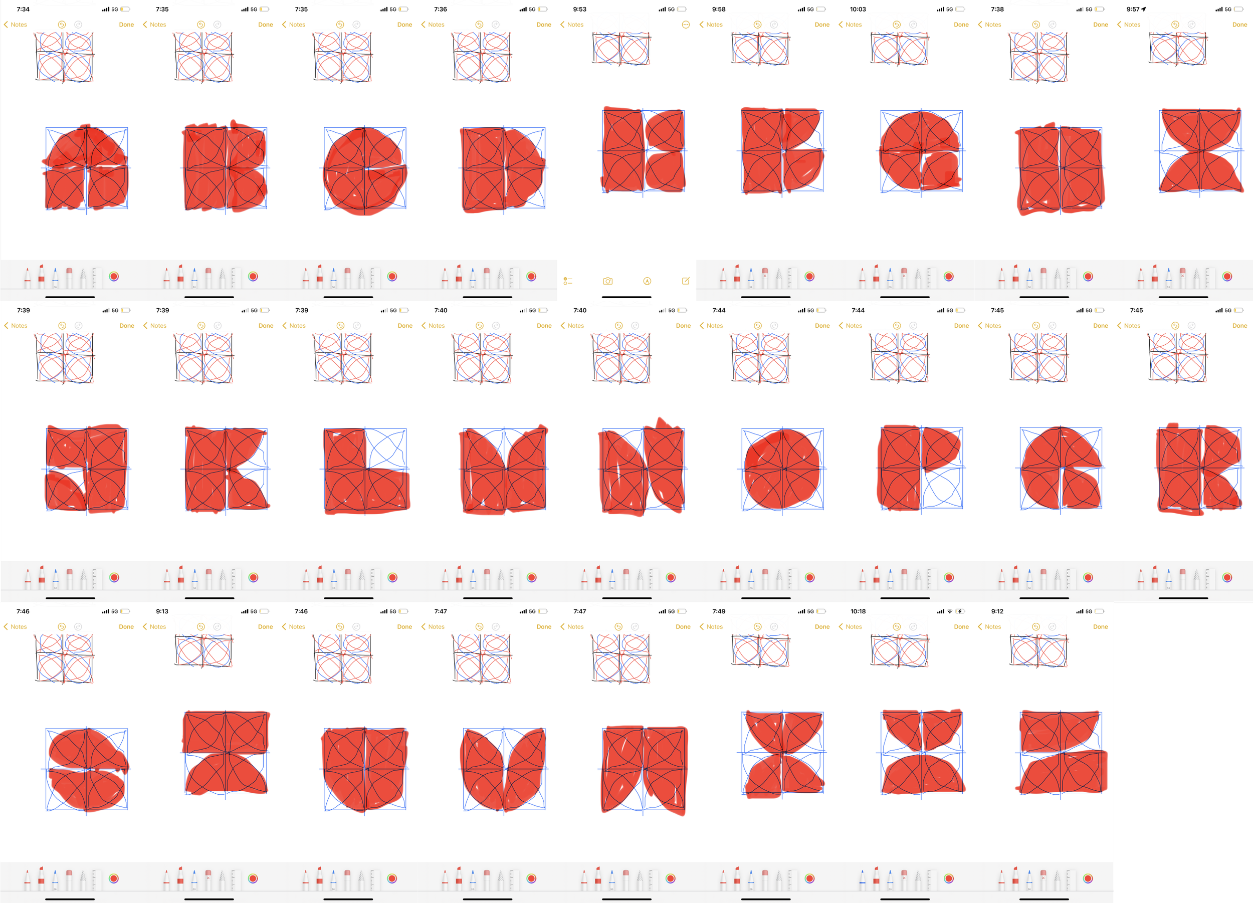
Many forms went through multiple iterations. Staying consistent with the overall style while preserving the legibility and uniqueness of each character was a challenge. The letter F was particularly hard to construct in the limited space given.
These and many more were all attempts to make the perfect F:

FULL GLYPH CATALOG
A final “contact sheet” view of all [76 total / 48 unique] glyphs, each labeled with their respective name and unicode(s).

Since Neo Tetra is intended to be a display typeface used in large titles and headings, I excluded symbols such as semicolon and parenthesis that would have been easy to make but not have much use. To follow the Bauhaus teaching of “Form Follows Function,” I kept the catalogue as concise as possible for its purpose, preserving the value of simplicity.
On the other hand, period, grave, asterisk, and asciicircum as circles in four positions aim to be used as forms that can be easily integrated by designers (or any user of the font) into their design wherever they see fit, their purpose being that of ornament and accessory to the layout.
GALLERY

less is more

form follows function

the quick brown fox jumps over the lazy dog

neo tetra

abcdefghijklmnopqrstuvwxyz0123456789